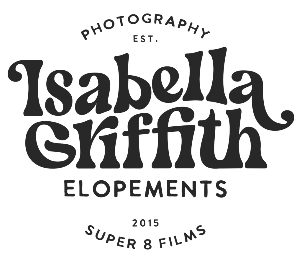
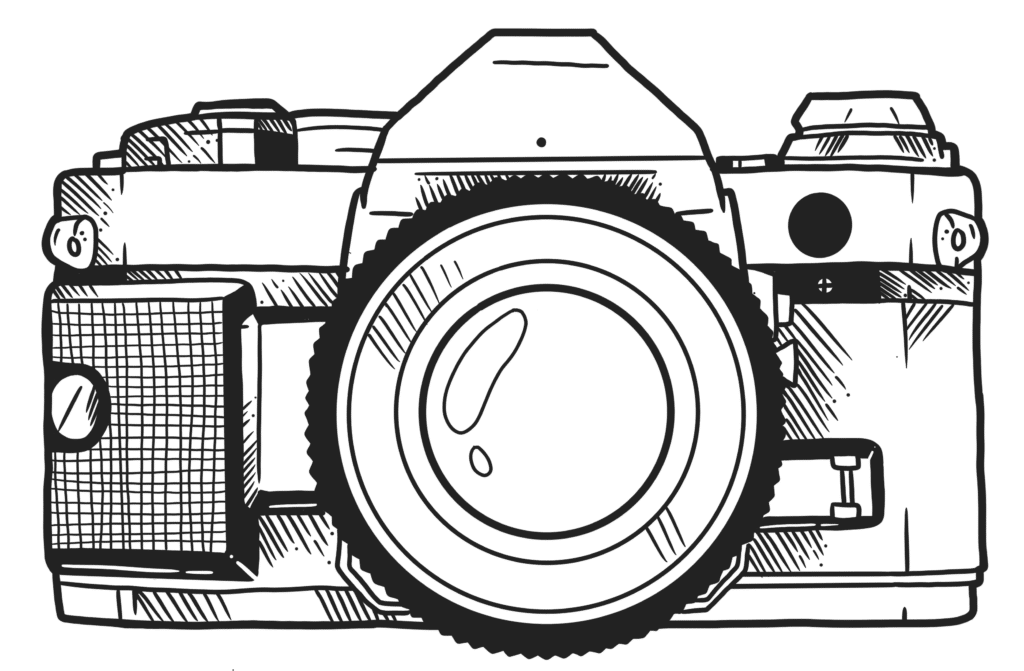
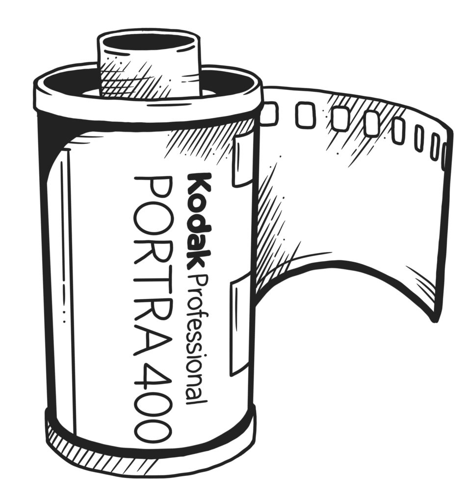
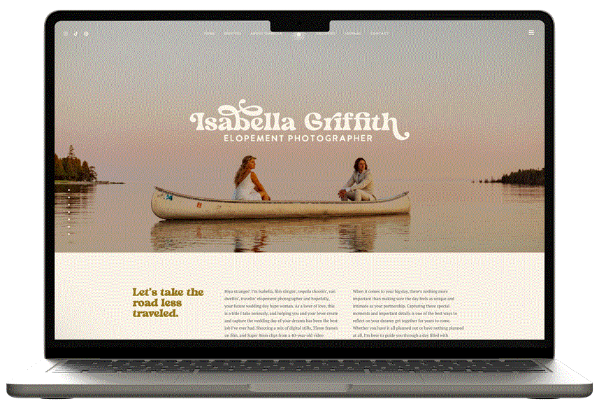
Isabella is a nomadic elopement photographer shootin’ love (and tequila) across the globe. Specializing in film, she brings warm nostalgic aesthetics and her contagious, joyful energy to all of her photoshoots. Isabella was in need of brand and website packed with personality and designed to help her growing business thrive. We developed a brand and website featuring custom illustrations, retro flourishes, and playful details (like a hidden Rick Roll) to create a fun experience through and through.
Isabella’s brand aesthetic is inspired by the groovy styles of the 70s with a spunky western flair. Think honky tonk meets roller rink, desert disco, retro rodeo.. you get the vibe. Together, we developed a palette that evokes nostalgia while remaining playful. The primary color, golden hour (also lovingly dubbed “pea soup green” by Isa), is grounded by the supporting neutrals: warm vanilla, charcoal, and western clay. The palette wasn’t complete without a bit of spice, so we added Ember Glow to round out the color selection.
Golden Hour
Warm Vanilla
Charcoal
Western Clay
Ember Glow
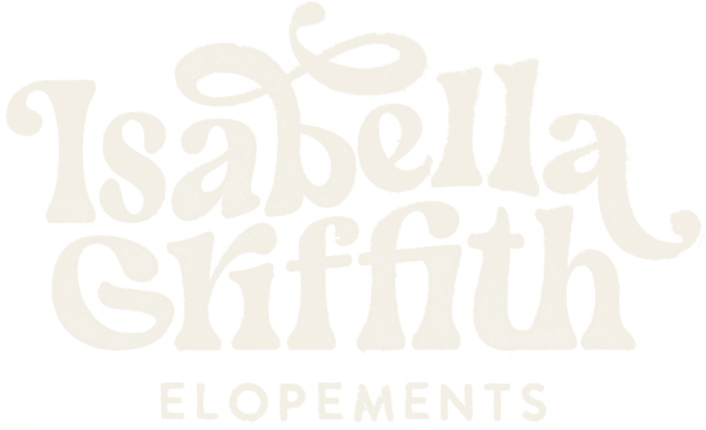
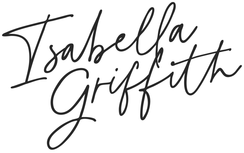
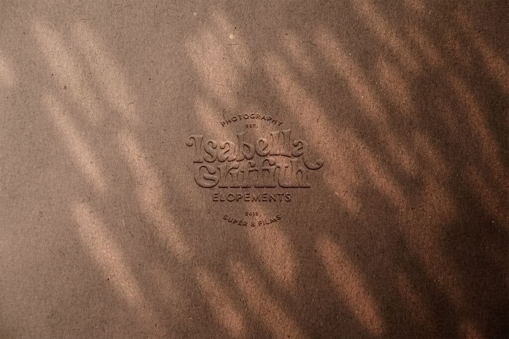
Logo & Primary Header
Kicker / sub-heading
Body Copy
Accent
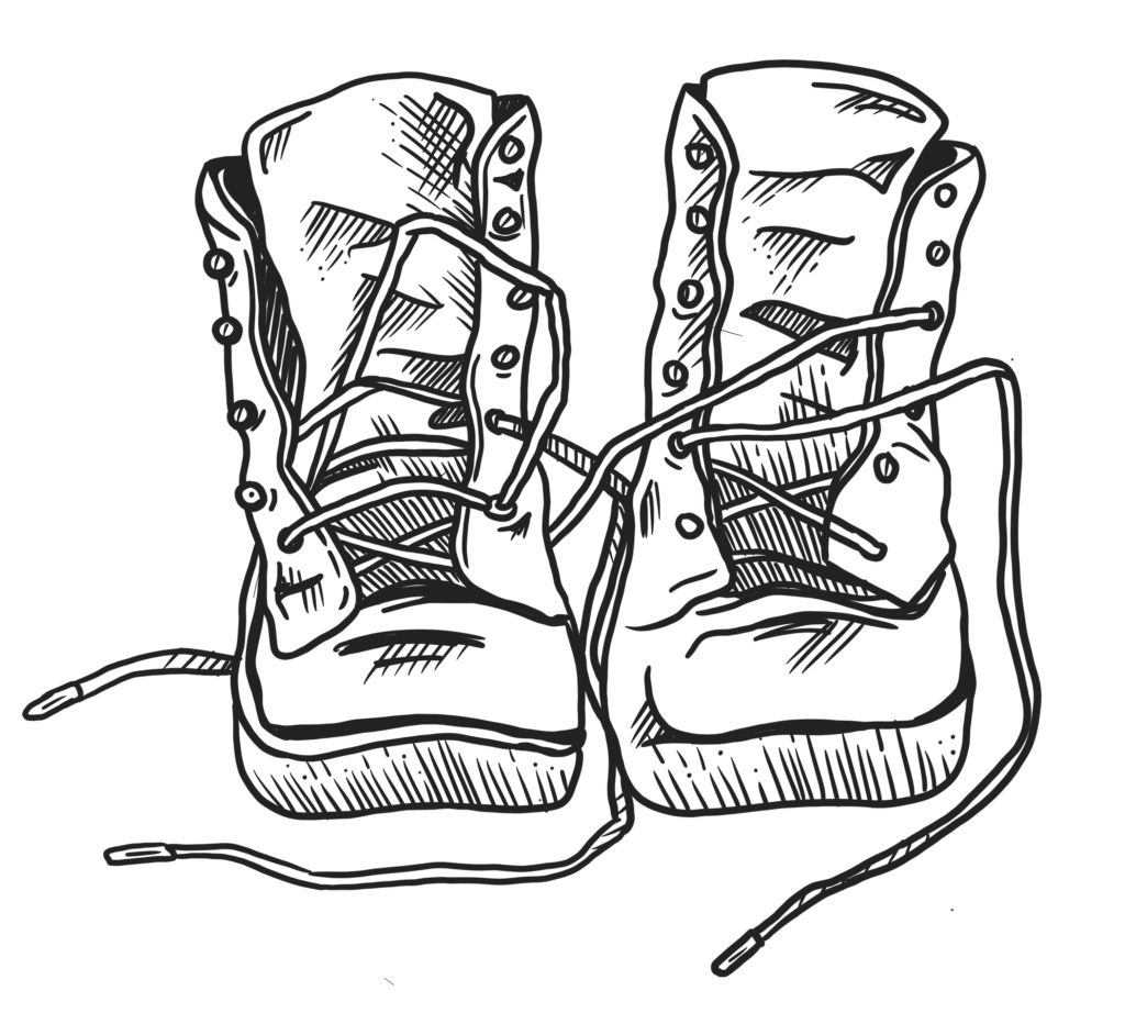
Custom Brand Illustrations
Custom Brand Illustrations
Website Design
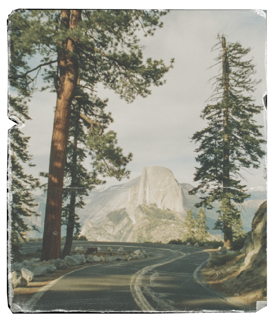
With a passion for film photography, Isabella captures the moment with authenticity and retro flair. As a film slingin’, tequila shootin’, van dwellin’, travelin’ elopement photographer – she brings the fun wherever she goes. Creating a website that captured her contagious energy made for such a fun design project.
Priorities: Two post templates for blogs & galleries, image management
It's all about the details -
Additional Slide-out Navigation
Isabella had a lot of sub-categories to her services and galleries. Rather than creating a mega-menu or a drop down, we opted to design a slide out menu. This enabled us to display all the details at once in list form.
Creating intuitive and simple navigations is an early priority in all web design projects, and each case is unique! For example, a drop down mega menu was better suited in the Jacey Out West website design project.
Black and White to Color Hover Effects
Maintaining contrast when overlaying text on images can be tricky. To help improve legibility, we simplified the photo with a black and white edit. This allowed the descriptive text stand out more clearly, but we still wanted to show off the original full-color image.
The solution? A full reveal on hover. The perfect location for this effect was on the linked tiles for Isabella’s services. The reveal of the full-color image showcases her talent and makes it all the more tempting to click the link and view more photos.
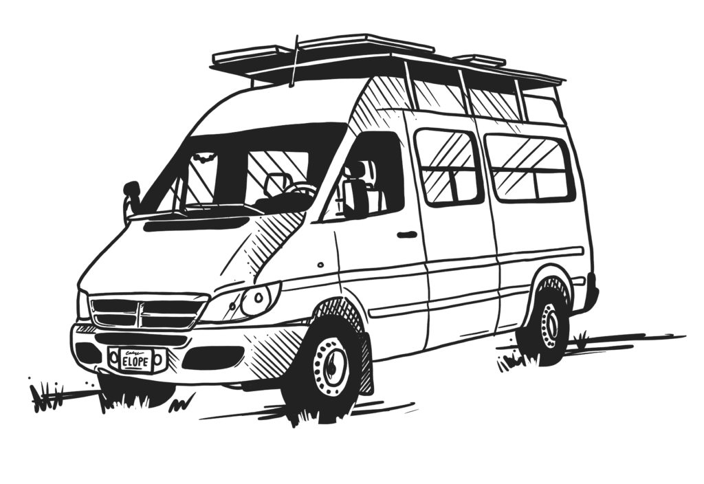
Interactive Full-Width Custom Illustration
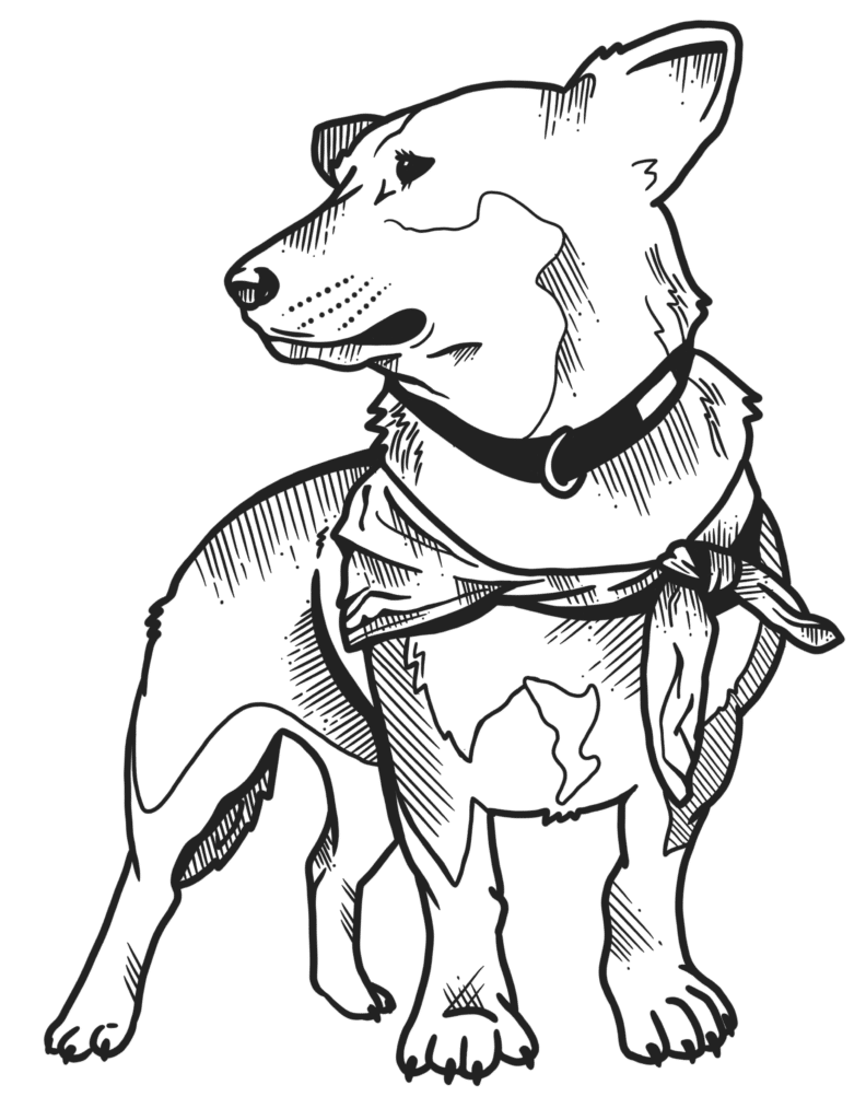
Okay, this might be one of our favorite details on the entire site. This drawing features so many personal details including Isabella’s van, her pup, Marlow, and a vintage radio to pull in the 70s vibe.
Since this is located on the “About Me” page, it’s main purpose is to provide some fun details about Isabella. This prompts site visitors to explore camp, where you can click on hot spots which reveal some of Isabella’s favorite things to get to know her better.
Created in collaboration with Copy Compass
Savannah created Copy Compass to help adventure-based brands communicate clearly – and ethically – with their target audiences. As a nature-obsessed entrepreneur and expert copywriter, she leverages carefully crafted copy to promote inclusivity and accessibility in the great outdoors. Copy Compass and Eunoia Design Co. have been teaming up for over a year to bring business owners a copy and design dream team.